

Key Topics:
- 3:25 – Speed: Faster Admin + Deliver More Assets from BD’s CDN
- 4:00 – Language: Text Label Libraries for German & French (released)
- 6:14 – Spam: Additional Protection Against Known Spam Characters
- 6:43 – Finance: Local Timezone Setting to Select Time to Process Payments
- 7:37 – Finance: Bulk Action Settings for the New Search Subscriptions Page
- 8:24 – Import: Image Support When Importing Posts via CSV File… and Later with Zapier
- 9:31 – Tons More: Speed, Security, Quality-of-Life Features & Exciting New Releases on the Way!
- 9:42 – 5 Best Practices for Homepage Hero Sections to Win-Over Visitors
- 10:27 – What Is a Homepage Hero Section
- 11:35 – What to Expect from a Bad Hero Section
- 13:56 – What to Expect from a Good Hero Section
- 15:34 – 1) Clear Value Proposition
- 19:06 – 2) Use Compelling Visuals
- 22:31 – 3) Avoid Clutter
- 26:20 – 4) Clear & Prominent Call to Action
- 31:34 – 5) Address Common Objections (Social Proof)
- 37:31 – Reviewing a nightlife and bar directory homepage
- 41:38 – Reviewing a B2B directory homepage
- 51:14 – What is bandwidth and why is it important?
- 53:00 – How to identify why website bandwidth is high?
- Best Practices: Optimize Images To Improve Website Speed – Watch Video
- 59:12 – How to identify top website searches?
- 1:01:12 – How to add custom HTML to specific website pages?
- How To Create, Edit & Call Custom HTML Widgets – Watch Video
Coming Soon
Tip of the Week
Questions & Answers

 AI-Generated Transcript – Please excuse any inaccuracies
Speed: Faster Admin + Deliver More Assets from BD’s CDN (00:03:25)
- A faster loading admin is expected to significantly improve the user experience, allowing pages inside the back end to load quicker and faster, giving more freedom as users navigate in the admin area (00:03:26).
- The faster admin is anticipated to provide a more flowy experience, saving time when navigating between pages, loading pop-ups, and more (00:03:32).
- Internal testing with staff and team members is currently underway to iron out any quirks before releasing the faster admin experience to everyone (00:03:48).
- Once the internal testing is complete, the faster admin experience will be released to provide a better experience for all users, with the goal of delivering more assets from the Content delivery network (00:03:56).
Language: Text Label Libraries for German & French (released) (00:04:00)
- German language is now a default text label language that can be selected for a site, in addition to English language, Spanish language, and French language, which were previously available (00:04:01).
- The site’s language can be set to German or French by going to the admin area, settings, and general settings, and selecting the desired language under localization (00:04:27).
- When the site’s language is set to German, most of the default text labels are automatically translated, but some elements, such as the main menu, need to be changed manually in the menu manager (00:05:20).
- The text label libraries are now available in four languages: German, French, Spanish, and English, and more languages will be added in the future based on popularity (00:06:07).
- The ability to set the site’s language to German or French allows users to jump start their site in another language, without having to manually change thousands of text labels (00:04:59).
- The default text labels can be updated automatically by selecting the desired language and checking the box to use that language as the text label, eliminating the need to manually change each label (00:05:07).
Spam: Additional Protection Against Known Spam Characters (00:06:14)
- Known spam characters and letters that are commonly used in spam messages have been identified to provide additional protection for website forms (00:06:14).
- An update will be pushed soon to protect forms and websites against these known spam characters, with the goal of significantly reducing spam inquiries (00:06:19).
- Spam is a relentless issue, and efforts are being made to continuously protect sites against it by finding new and novel ways to identify spam (00:06:33).
- The identification of known spam characters is part of a broader effort to protect websites from spam, and this protection will be implemented through an upcoming update (00:06:35).
Finance: Local Timezone Setting to Select Time to Process Payments (00:06:43)
- The finance tab is being updated to accommodate users in different time zones, such as Australia, with a new setting to localize payment processing times (00:06:44).
- Currently, payments are processed at a certain time of day based on the server’s time, but the new setting will allow users to choose when scheduled payments are processed on their site, for example, at midnight in their local time zone (00:06:50).
- The new setting aims to solve the issue of scheduled payments being processed at inconvenient times for users in different parts of the world, such as towards the end of their day (00:07:22).
- With the new setting, users will be able to specify the time of day for scheduled payments to be processed, allowing for more control over payment processing and alleviating issues caused by time zone differences (00:07:05).
- The update is expected to be released soon and will help improve the payment processing experience for users worldwide, particularly those in different time zones (00:07:34).
Finance: Bulk Action Settings for the New Search Subscriptions Page (00:07:37)
- The new search subscriptions page, which was launched several weeks ago, will be adding several bulk action settings, allowing users to manage subscriptions more efficiently (00:07:38).
- The search subscriptions page can be found under the finance tab, and the bulk action settings will include a checkbox that enables users to end subscriptions, update the next bill date, and update the billing amount (00:07:47).
- The bulk action settings will provide users with the ability to update a group of members and their subscriptions, such as changing the price, stopping subscriptions, or adding an extra month free, making it easier to manage multiple subscriptions at once (00:08:08).
- The bulk action settings will be added to the existing search subscriptions page, and users will be able to perform various actions, including updating the next bill date and the billing amount, using the bulk actions feature (00:07:52).
- The addition of bulk action settings to the search subscriptions page is expected to improve the user experience and make it easier to manage subscriptions in bulk, with features such as ending subscriptions, updating billing information, and more (00:08:14).
Import: Image Support When Importing Posts via CSV File… and Later with Zapier (00:08:24)
- A feature to import posts with a CSV file was recently released, allowing users to import events or job listings, similar to importing members, but it currently lacks image support (00:08:24).
- The ability to upload posts with images is being developed, which will enable users to have a feature image attributed with the event post or blog article (00:08:29).
- The infrastructure created for importing posts will be used to make this feature available for use with tools like Zapier, Pably, and Greenlee, allowing users to import posts to their site (00:08:57).
- With the ability to import posts using tools like Zapier or the API, users can hook up to an RSS feed and start populating their site with content, which is expected to be a useful feature (00:09:18).
- The updates, including the import feature and upcoming image support, are part of a larger set of updates that have been released, with more updates expected to follow (00:09:30).
Tons More: Speed, Security, Quality-of-Life Features & Exciting New Releases on the Way! (00:09:31)
- Several noteworthy updates are coming soon, including improvements to speed, security, and sensibility, which are expected to be released very soon (00:09:33)
- These updates will also include a lot more features related to speed, security, and sensibility, in addition to the ones already mentioned (00:09:34)
- The upcoming updates will provide enhancements to the overall quality of the website, with a focus on speed, security, and sensibility updates (00:09:38)
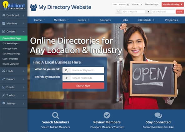
5 Best Practices for Homepage Hero Sections to Win-Over Visitors (00:09:42)
- The topic of discussion is the hero section of a website, which is the first thing people see when they visit a site, located above the fold at the top of the screen, and this concept has been previously covered in other webinars (00:09:42).
- A hero section is a dedicated part of a website that has specific settings in the design settings for a website, and it is essential to understand the basics of a hero section to create an effective one (00:10:16).
- The presentation will cover the fundamentals of a hero section, including its definition and importance, as a starting point for creating a great hero section (00:10:26).
- The hero section is a crucial part of a website’s design, and understanding its basics is necessary to win over visitors and create a great website (00:09:53).
What Is a Homepage Hero Section (00:10:27)
- A homepage hero section is a visually prominent section on a website’s home page that aims to grab the visitor’s attention and communicate what the website is offering, with the purpose of encouraging visitors to stick around and explore more (00:10:29).
- The hero section typically includes a visually appealing image or an embedded video, a tagline that summarizes the website’s offering, and a Call to action (marketing), such as a search box, email submission form, or a button linking to another page (00:10:49).
- The ideal place to include this information is in the hero section, as it is the first thing visitors will see when they arrive at the website, especially if it’s their first time visiting the home page, and it’s essential to make a great first impression and grab their attention before they need to scroll down (00:11:21).
- The hero section should effectively convey the website’s purpose and entice visitors to explore further, making it a crucial element in capturing their interest and encouraging them to engage with the website (00:11:32).
What to Expect from a Bad Hero Section (00:11:35)
- A bad hero section can make it difficult for visitors to understand the purpose and meaning of a website, especially if there is too much text or the text is unclear, leading to higher bounce rates and lower engagement (00:11:45).
- This can result in a potential loss of sales leads and negatively impact the overall user experience, particularly for new visitors who are not yet familiar with the website or its offerings (00:12:16).
- A bad hero section may also lack a clear Call to action (marketing), leaving visitors without direction and causing them to simply scroll down the page instead of engaging with the website’s content (00:13:08).
- The use of too many images, such as multiple stock photos, can also be detrimental to a hero section, as it can be visually overwhelming and fail to draw the visitor’s eye to a specific point (00:13:01).
- Additionally, attempting to include too much information in the hero section can be counterproductive, as it can confuse visitors and make it harder for them to understand the website’s purpose, with the key principle being that less is often more in this context (00:13:48).
What to Expect from a Good Hero Section (00:13:56)
- A good hero section is able to help new visitors understand the website’s purpose and what it is offering, and having a lot of information can muddle the waters, whereas focusing on a specific point is more beneficial (00:13:57).
- A clean, modern, and straight-to-the-point hero section can lead to increased engagement, more leads or sales, and a positive impact on users, ultimately improving the brand image and credibility for new visitors (00:14:29).
- The hero section can be thought of as the first impression made on new visitors, so it is essential to put the best foot forward and distill down the message to convey it in the fewest and least amount of words possible (00:14:48).
- The message should touch on emotional or beneficial points rather than the features that visitors will receive, and this will be discussed further as a best practice (00:15:18).
- To create an effective hero section, it is necessary to figure out how to convey the message in a way that connects with visitors, without stuffing the page with too much verbiage, titles, and messaging (00:14:56).
1) Clear Value Proposition (00:15:34)
- Establishing a clear value proposition is crucial to convince visitors to stay and explore the website, and it involves highlighting the prime benefit of the membership plans and addressing the concerns of the target audience (00:15:34).
- The value proposition should resonate with the target audience, and it is essential to figure out what the target audience is looking for and what they need, and then hammer home on that point to solve their problems (00:15:48).
- A good example of a clear value proposition is Netflix’s home page, which puts its value proposition front and center, offering unlimited movies, TV shows, and more, with a visually appealing image and a clear call-to-action (00:16:17).
- The concept of a clear value proposition can be applied to various industries, such as offering access to a curated directory of professionals in a certain industry or region, and it is essential to outline simple and clear benefits (00:17:10).
- Minimalism can be an effective way to portray confidence in what is being offered, as seen in Netflix’s hero section, which shows that it is not necessary to oversell what is being offered (00:17:29).
- Another example is Amazon Prime’s hero section, which, although it has a lot to offer, can be overwhelming, but still has a clear call-to-action and visually appealing images (00:17:44).
- Amazon Prime’s hero section tries to encompass all of its offerings, including free and fast delivery, exclusive discounts, and content elements, but it can be challenging to narrow it down (00:17:50).
- Despite having a lot to offer, Amazon Prime’s call-to-action is still extremely apparent, with a bright orange button and a free 30-day trial offer (00:18:17).
2) Use Compelling Visuals (00:19:06)
- Using compelling visuals in the hero section of a website makes it visually appealing and emotionally engaging, allowing visitors to connect on an emotional level more easily than through text alone (00:19:09).
- The image or video used should be high-quality, represent the brand well, and resonate with the target audience to emotionally appeal to them (00:19:26).
- A good hero section should have a clear and minimal design, such as the example of Eventbrite, which uses a different visually appealing image for every visitor and has a clear Call to action (marketing) (00:20:10).
- The use of bright colors and images that show people engaging in activities, such as in the example of Skillshare, can make the hero section more engaging and encourage visitors to take action (00:21:01).
- The call to action should be front and center, such as in the example of Skillshare, which has a prominent call to action to “explore your creativity” and an email address input field (00:21:26).
- For B2B sites, the hero image should show the convenience of using the site or service, while for consumer-facing sites, it should show happy people having good results using the site (00:22:11).
- The image used should connect with the target audience, whether it’s a consumer or a business, and show emotional features such as happiness or satisfaction (00:22:03).
- Resources such as stock photo websites can be used to find good background images for the hero section, and the image should be chosen to appeal to the target audience (00:21:56).
3) Avoid Clutter (00:22:31)
- Avoiding clutter in a website’s hero section is crucial, as too many visuals and pieces of text can be overwhelming and confusing, making it difficult for visitors to quickly comprehend the website’s offering at a glance (00:22:31).
- A cluttered hero section can lead to visitors leaving the site or missing important calls to action, which is why it’s essential to focus on the value proposition and nail down a clear and concise message, such as two lines of text that convey the website’s offering (00:22:50).
- Using an image with text embedded in it can be problematic, as it may stretch or squeeze on different mobile devices, making it difficult to get it exactly as desired, and it’s recommended to use the background image to show people, actions, or places and have the text separately as title text (00:23:29).
- Having too much overlapping text as part of the image and title text can also contribute to clutter, and it’s better to have a clean and simple design that effectively communicates the website’s message (00:24:06).
- Examples of well-designed hero sections can be seen on websites like Squarespace, which uses a bright and engaging image, big text, and a clear Call to action (marketing), such as the “get started” button, to focus on the e-commerce aspect and appeal to its target audience (00:24:15).
- Another example is HubSpot, which uses a simple design to highlight the benefits of its software, with a clear tagline and a prominent call to action button, effectively conveying its message and appealing to its target audience of larger businesses (00:25:08).
- The key to a great hero section is to distill down the language and figure out how to relay and connect the message to make it resonate with the audience, using a clear and concise value proposition and a simple design that effectively communicates the website’s offering (00:26:07).
4) Clear & Prominent Call to Action (00:26:20)
- A great website hero section should have a clear and prominent call to action, encouraging visitors to take action or learn more about the membership site, which can be a button or a simple search box, such as a keyword or location search (00:26:20).
- The Call to action (marketing) should be clear and apparent, and having too many calls to action can be overwhelming for visitors, making it difficult for them to figure out where to click, and instead, website owners should create a portal experience with broader sections (00:27:05).
- Creating a portal experience involves setting up broader portal pages that link to more specific pages, rather than making all granular pages available immediately, which can also improve SEO by giving Google a better navigation path through the website (00:27:22).
- A good example of a clear call to action is the search box on Coursera’s website, which is accompanied by a subheading that speaks to the target audience and provides suggestions for searches (00:28:02).
- Having smiling, happy people on the website can also help to create a good feeling and build trust with visitors, and adding a tag cloud link under the homepage search module can provide a simple call to action (00:29:05).
- The tag cloud link can be used to display trending or most popular searches, allowing visitors to click on common searches without having to search, and this feature will be made available soon through the menu manager (00:29:20).
- The goal of the hero section is to take people from the home page to an internal page, and providing a clear call to action and a simple way to search can help to achieve this goal (00:29:51).
- A great website hero section should allow visitors to quickly understand the website’s purpose without leaving, as seen in examples like Strava, which has a straightforward Call to action (marketing) to join their community of athletes and people interested in physical activities (00:29:57).
- Strava’s hero section is effective because its messaging and call to action are stripped down, making it clear that they want people to record their workouts, share them with the community, and interact with others based on their activities (00:30:07).
- The call to action in Strava’s hero section takes up a significant amount of vertical space, prompting visitors to register through various methods, including Facebook, Google, Apple Inc., or email, and is supported by a collage of images showcasing the app’s features and people engaging in physical activities (00:30:36).
- The use of images and screenshots in Strava’s hero section helps to solidify what the website and community offer, making it clear what visitors can expect from the platform (00:30:51).
- Every home page is unique and reflects the brand’s voice and persona, with some being calmer or more aggressive, and Strava’s hero section is an example of a louder and more attention-grabbing approach (00:31:14).
- The call to action in Strava’s hero section is straightforward, simply asking visitors to sign up, which is an effective way to encourage engagement and conversion (00:31:28).
5) Address Common Objections (Social Proof) (00:31:34)
- Providing social proof is an effective way to address common objections and help new visitors overcome their initial resistance to joining a website, especially if it’s a paid membership or service, by showcasing that the offering works for other people through testimonials, user reviews, text, images, or videos (00:31:34).
- The hero section of a website can be used to build initial trust with new visitors and encourage them to join, as seen in examples from HootSuite and Master class, which use large sections with striking images and clear value propositions to showcase customer success stories and courses presented by well-known people (00:32:33).
- HootSuite’s hero section is a clear value proposition that shows their customer success stories, with a striking black and white image on a colorful background, and a title that explains what HootSuite is capable of doing, such as helping a nearly 100-year-old company succeed by grabbing more customers through social media (00:32:54).
- MasterClass’s hero section is focused on providing courses presented by celebrities or well-known people, and they show off big names and faces at the top of their home page, while also using a horizontal slider with short testimonials from users, accompanied by high-quality images with smiling faces (00:33:26).
- For newer websites, it may be more difficult to get celebrity names or big endorsements, but using testimonials, star ratings, and reviews can be an effective way to build trust and credibility, as seen in the example of Brilliant Directories’ landing page, which includes a star rating from a review and a demo form (00:34:40).
- Adding a star rating or review to the hero section of a website can be a good way to include social proof and build trust with new visitors, and it can be done by including it in an image or floating it with CSS or HTML (00:34:53).
- A website’s hero section can be used to showcase one of its members, such as a lawyer with a high number of reviews, to provide social proof and demonstrate that the site is being used, with an example given at (00:35:25).
- The hero section can also be used as an upsell or boost to members, allowing them to be featured on the home page, which can be a desirable option for members who want to increase their visibility, (00:35:53).
- Showing a star rating on the home page can be an effective way to provide social proof, and it does not have to be a testimonial, but can instead highlight a member in the directory, (00:36:09).
- The home page is a critical component of a website, and it is essential to ensure that it is working for the site, rather than against it, with many sites failing to change the default message that comes with a website template, (00:36:36).
- A website’s home page can be improved by sharing it with others and receiving feedback, with an offer made to take a look at a site and provide tips to help with the home page hero section, (00:36:55).
- An example of a website that could be improved is barandclub.com, which was shared by a user named Brian, who is from Chandler, Arizona, and was reviewed to provide feedback on its home page, (00:37:12).
Reviewing a nightlife and bar directory homepage (00:37:31)
- The homepage of a nightlife and bar directory website is being reviewed, with the goal of improving its hero section to make it more effective at guiding users to search for specific businesses or categories, such as “fine local nightlife in your area” (00:37:34).
- The current search function asks users to “enter name or keyword”, but it may be more helpful to provide examples of things to search for, such as “search dive bar” or other category names, to give users a “helping hand” and make the search process faster (00:38:15).
- The website has a good main menu, but it could be simplified to reduce the number of menu links and create a more portal-like feel, with options such as “Jobs”, “Drink”, and “Media” (00:38:51).
- The use of images on the website is also being discussed, with the idea of using a background image to enhance the visual appeal of the site, and the question of how to implement this feature is being considered (00:39:09).
- The idea of creating a portal-like experience on the website is being explored, with the goal of taking users deeper into the site and reducing the need for multiple menus and sub-menus (00:40:20).
- The search function could be improved by changing the name field to a drop-down menu with top-level categories, which would allow users to quickly select a category and start searching (00:40:52).
- The website’s design and functionality are being discussed with the goal of making it more user-friendly and effective at guiding users to search for specific businesses or categories (00:41:07).
Reviewing a B2B directory homepage (00:41:38)
- The website in question appears to be a professional B2B website, with a focus on supply chain partners, involving logistics, shipping, manufacturing, and other related areas, and it aims to improve inbound, internal operations, and outbound supply chains across key areas such as technology, physical movement, people development, and process improvement (00:41:42).
- The site has been received with interest and traction, with over 24,000 people in its audience, and it has recently established individual and corporate membership options, which are currently free, in order to create a professional community and promote expert members (00:42:36).
- The website is set up as a directory to help find support and supply chain experts for different areas, and people can join to be found and to find supply chain partners, with a range of categories and services available (00:43:15).
- The site has a significant amount of content, including a marketplace, expert directory, and podcast, and it promotes its members through various channels, including Partners TV and podcast (00:44:12).
- The website’s hero section has been reviewed, with some suggestions for improvement, including making the language more explicit and less reliant on buzzwords, in order to better communicate the benefits of joining the site, such as gaining access to experts, innovative solutions, free coaching, education, and networking (00:44:44).
- The hero section currently states that joining the site will provide access to experts, innovative solutions, free coaching, education, and networking to accelerate business and supply chain performance, but it could be improved by making the benefits more specific and clear (00:45:10).
- The website’s hero section is professional, but the “join free today” call-to-action is vague, leaving uncertainty about what users are registering for, such as searching the directory or accessing specific content (00:46:01).
- Having two types of people in mind, general users and experts, could lead to creating two separate calls to action, providing more context for visitors and clarifying the possibilities for engagement with the site (00:46:55).
- Adding more context to the membership options section, such as specifying “for who,” could enhance clarity and provide a better understanding of the available options (00:47:52).
- The website has a lot of content, and simplifying the main menu by bundling similar links together, such as resources, events, training, products, and services, could improve navigation and reduce clutter (00:48:25).
- Consolidating menu items into a fewer number of main links, such as search the directory, services, and products, could simplify the user experience, but it’s essential to consider the impact on traffic and user behavior (00:49:12).
- The current menu layout may be at its limit, and using a wider screen or smaller monitor could exacerbate the issue, making it essential to strike a balance between providing necessary options and avoiding clutter (00:49:45).
- The website in question has a great overall design, but could benefit from providing more context and being more explicit about who is being asked to sign up and what they will be getting in return (00:50:20).
- The site’s owner is asked if the current design is working for them, and some tips are provided for consideration, including being more giving and providing more context (00:50:29).
- Melissa joins the conversation and is given the opportunity to share her site or ask a question, but she mentions that her question is not related to the current conversation (00:50:57).
- The conversation is opened up to allow Melissa to ask her question, which can be about anything that is on her mind, providing a chance for her to receive help or guidance (00:51:08).
- The tone of the conversation is helpful and supportive, with the goal of assisting the site’s owner and Melissa with any questions or concerns they may have (00:51:10).
What is bandwidth and why is it important? (00:51:14)
- Bandwidth refers to the amount of data that a website can send back and forth to its visitors, similar to cellular data on a cell phone, and it is an important aspect to consider when managing a website (00:51:29).
- A website’s bandwidth can be affected by large file sizes, such as high-resolution images on the home page, which can use up a significant amount of bandwidth when visitors download them (00:51:40).
- Optimizing images and other resources can help alleviate bandwidth issues, but high traffic to a website can also use up bandwidth, even if everything is optimized (00:52:02).
- If a website surpasses its bandwidth usage, it will not shut down, but rather trigger a notification to review the site and determine if there are any optimization opportunities or if the high traffic is legitimate (00:52:18).
- In the case of the website christianhandmadedirectory.com, a review of the site can be conducted to identify any potential issues with bandwidth usage and provide recommendations for optimization (00:52:45).
How to identify why website bandwidth is high? (00:53:00)
- The home page of a website is being reviewed for optimization, with tools like Google Page Speed and GT metrics being used to identify areas for improvement, such as high file sizes loading on the page (00:53:00).
- A large background image, approximately 3.8 megabytes in size, is identified as a potential issue, and optimizing this image is discussed as a way to improve page load times (00:53:55).
- The image is optimized by resizing it to 1800 by 1000 pixels, saving it as a JPEG instead of a PNG, and reducing the quality to 80, resulting in a significant reduction in file size (00:54:38).
- Further optimization is achieved by removing metadata from the image using a tool, which reduces the file size from 3800 kilobytes to 742 kilobytes, and then to 385 kilobytes (00:55:28).
- The image is then converted to webp format, which results in a final file size of 122 kilobytes, with minimal visible difference in quality (00:56:14).
- The importance of optimizing images for web use is emphasized, particularly for background images, and the potential for significant file size reductions without noticeable quality loss is highlighted (00:56:30).
- The consideration of whether the look of a website is worth the potential trade-offs, such as saving bandwidth and loading pages faster, is crucial, as everything is a give and take (00:56:38).
- The speed at which people see the content on a website load is not the same as the speed of the website, but rather how much data is being sent back and forth to the visitor, with the homepage being the most visited page and a significant factor in bandwidth transfer (00:56:55).
- Changing a single image on the homepage can significantly impact the website’s performance, with the old performance showing 91 on GT metrics and the new performance potentially showing better results after making the change (00:57:28).
- To improve website performance, it’s essential to identify and address elements that are hogging up bandwidth, such as unnecessary scripts and images, and consider moving them to the footer or loading them only on specific pages (00:57:50).
- Using tools like Google Tag Manager and Facebook login can also impact website performance, and it’s crucial to assess whether they are necessary for the homepage or can be added only to specific pages, such as the sign-up page (00:58:10).
- Reviewing design settings and cleaning up unnecessary elements can help improve website performance, and it’s essential to be targeted with where scripts and other elements are loaded to minimize their impact on bandwidth (00:58:52).
How to identify top website searches? (00:59:12)
- To identify top website searches, using Google Analytics is recommended, which can provide insights into the most visited pages on a site and help determine what to feature at the top of the menu (00:59:22).
- In Google Analytics, navigating to the “Behavior” section and then to “Site Content” and “All Pages” will display all the pages visited on the site, allowing for analysis of site search data (00:59:38).
- To find pages with site search data, typing “site search” in the analytics search bar and selecting a suitable time frame, such as a month or two, will show the top pages with site search results (01:00:00).
- By analyzing these top pages, it is possible to see what searches were conducted and gain an understanding of the most popular search topics on the site, giving a pulse of the highest searched type of pages (01:00:21).
- This information can be used to inform decisions about what to feature prominently on the site, such as at the top of the menu, to better assist users in finding what they are looking for (00:59:17).
How to add custom HTML to specific website pages? (01:01:12)
- To add custom HTML to specific website pages, users can create a new widget in the widget manager, give it a nickname, and put their HTML code in the designated box, allowing for CSS styling and JavaScript without needing to open up a style tag or script tags (01:01:31).
- The custom HTML code can be added to any webpage by copying the shortcut code and pasting it into the desired page, making “widget equals” a useful tool for rendering HTML in the widget manager (01:02:48).
- The “widget equals” code can also be used as text labels, allowing users to add custom HTML anywhere on their website where there is an open field to paste the value in the admin area (01:03:14).
- By getting familiar with the “widget equals” code, users can start putting custom HTML code anywhere on their site, providing more flexibility and control over their website’s design and functionality (01:03:25).
- For further learning, a video from the blog, “Mastering Source Code Changes: How to Create, Edit, and Call Custom HTML Widgets” by Matthew Brooke, is available, providing more information on working with custom HTML widgets (01:03:44).