

This Tip of the Week covers topics including:
- 0:42 – What Is a Homepage Hero Section
- 1:50 – What to Expect from a Bad Hero Section
- 4:11 – What to Expect from a Good Hero Section
- 5:49 – 1) Clear Value Proposition
- 9:21 – 2) Use Compelling Visuals
- 12:46 – 3) Avoid Clutter
- 16:35 – 4) Clear & Prominent Call to Action
- 21:49 – 5) Address Common Objections (Social Proof)
This is a segment from Webinar Wednesday 151, recorded live on February 15, 2023.

Unleashing the Potential of Your Homepage for Maximum Conversions
In the ever-evolving landscape of web management and digital strategy, the promise of a meticulously designed website can often be met with the challenge of fully realizing its potential. If you’ve ever felt the tug of this challenge, take heart – you’re not alone. Today, we embark on a journey that celebrates the boundless opportunities to optimize your homepage, transforming it into a powerhouse of conversions and user engagement. With an unwavering focus on harnessing the strength of strategy and precision, we’ll explore the tried-and-true techniques that empower your homepage to radiate digital success. Get ready to uncover the art of homepage enhancement, where each click represents an exciting step towards a brighter digital future. 🌟
The Quest for Clicks Begins
Imagine this: You stumble upon a website that looks like it was decorated by a hyperactive squirrel. Buttons and banners are competing for your attention like it’s a circus, and you can’t even figure out what the website is supposed to do. Yeah, that’s the vibe we’re trying to avoid. If you’re scratching your head wondering why your homepage isn’t converting, it might be time to roll up your sleeves and work a little design magic.
1) The Crystal Clear Spell: Value Proposition
Alright, my savvy web creators, first things first – let’s make sure your visitors know exactly what you’re offering. Your value proposition is like a golden ticket; it should be clear, concise, and compelling. Don’t leave your visitors playing detective. Spell it out for them. If your website is a place for dog lovers to find the finest bow-wow accessories, say it loud and proud. “One-stop shop for Canine Couture? Oh, yes, please!”
2) The Visual Enchantment: Compelling Visuals
Guess what? People are visually wired creatures. So, if your homepage looks like a time capsule from 1999, it’s time for a makeover. Sprinkle some eye-catching visuals around – vibrant images, sleek graphics, and maybe even a pinch of charming animation. Imagine you’re inviting them to a party, and your visuals are the dazzling decorations that set the mood. It’s like catnip for clicks.
3) Decluttering Charms: Avoiding the Chaos Curse
Picture this: You walk into a friend’s house, and there’s stuff strewn everywhere. You can’t even find a place to sit without knocking over a stack of old magazines. Annoying, right? The same goes for your homepage. Keep it tidy. Organize your content so that visitors can find what they’re looking for without needing a treasure map. White space is your friend – it gives your content room to breathe and lets your visitors relax.
4) The Call to Adventure: Clear & Prominent CTA
Alright, party planners, it’s time to rally the troops! Your Call to Action (CTA) should be like a beacon guiding lost ships through the night. Make it crystal clear what you want your visitors to do next. Whether it’s signing up for your newsletter, exploring your product catalog, or booking a consultation, your CTA should stand out like a unicorn in a flock of pigeons.
5) Slaying Objections: Social Proof Sword
Ever hesitated to try a new restaurant until your friend raved about it? That’s social proof in action. Address common objections that might be holding your visitors back from clicking that glorious CTA. Share testimonials, reviews, or success stories that prove your website isn’t just a bunch of empty promises. Show ’em that others have taken the plunge and emerged victorious.
Making the Magic Work for You
Now, let’s talk real-world scenarios. These tips aren’t just reserved for a specific kind of website – they’re universal spells that can work wonders for different domains. Here are five scenarios where these tips shine like a dragon’s hoard:
- E-Commerce Platforms: Online stores selling a wide range of products can leverage these tips to clearly communicate their unique value proposition, showcase visually appealing product images, streamline navigation for seamless shopping, strategically place prominent CTAs for purchases, and display customer reviews to build trust.
- Service-Based Businesses: Websites offering professional services such as coaching, consulting, or design can employ these strategies to articulate their value, use visuals to convey successful outcomes, declutter their design to focus on services, include strong CTAs for inquiries or bookings, and showcase client testimonials to establish credibility.
- Travel and Hospitality Sites: Platforms catering to wanderlust seekers can benefit by highlighting their distinct travel experiences, incorporating captivating imagery of destinations, organizing their site for easy exploration, featuring clear CTAs for package bookings, and displaying testimonials from satisfied travelers to inspire confidence.
- Health and Wellness Portals: Websites focusing on fitness, wellness, and self-improvement can apply these techniques to communicate their unique approach, showcase transformational visuals, maintain a clean design for user ease, use CTAs for subscription or program enrollment, and share success stories to motivate potential clients.
- Creative Showcases: Platforms designed to showcase artistic works, such as galleries, photography portfolios, and creative portfolios, can capitalize on these methods by expressing their artistic vision, presenting captivating visuals, utilizing clean design for an unobtrusive experience, providing easy ways to inquire or purchase, and showcasing feedback from appreciative patrons.
Elevate Your Online Presence
As we conclude our exploration of homepage optimization, remember that the path to digital success is not just about creating a homepage; it’s about crafting an experience. By implementing these five strategic tips – clarifying your value proposition, incorporating compelling visuals, decluttering your design, employing clear and prominent calls to action, and leveraging social proof – you are arming yourself with the tools to engage, convert, and thrive in the digital landscape. Your website is your canvas, and with the right strokes of design and strategy, you can paint a masterpiece that captivates audiences, drives conversions, and propels your online presence to new heights. So, go forth with confidence and watch as your homepage becomes a beacon of success in the vast digital sea. 🌟
 AI-Generated Transcript – Please excuse any inaccuracies
Introduction (00:00:00)
- The topic of homepage design has been covered in previous webinars, and this particular discussion focuses on the hero section, which is the first thing people see when they visit a website, specifically the area above the fold at the top of the screen (00:00:00).
- The hero section is a crucial part of a website’s design, and there are dedicated settings for it in the design settings for a website, but the discussion aims to cover the basics from the ground floor (00:00:10).
- Many people are likely already familiar with the concept of a hero section, but the discussion will start with the basics and provide information on how to effectively design this section (00:00:27).
- The presentation will provide an overview of the hero section, including its importance and how to make the most of it, with the goal of educating the audience on best practices for designing a website’s hero section (00:00:38).
What Is a Homepage Hero Section (00:00:42)
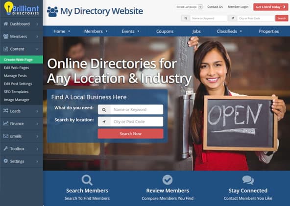
- A homepage hero section is a visually prominent section on a website’s home page that aims to grab the visitor’s attention and communicate what the website is offering, with the purpose of encouraging visitors to stick around and explore more (00:00:42).
- The hero section typically includes a visually appealing image or an embedded video, a tagline that summarizes what the website is offering, and a Call to action (marketing), such as a search box, email submission form, or button linking to another page (00:00:47).
- The call to action in the hero section can direct visitors to other pages on the website, and this section is ideal for including such information because it is the first thing visitors see when they arrive at the website, even before they need to scroll down (00:00:51).
- The hero section is crucial for making a great first impression, grabbing the visitor’s attention, and ensuring they are interested in exploring the website further (00:00:59).
- The information included in the hero section should be attention-grabbing and engaging, as it will be the first thing visitors see when they arrive at the website for the first time, and it should encourage them to stay and explore more (00:01:07).
What to Expect from a Bad Hero Section (00:01:50)
- A bad hero section can lead to visitors not understanding the purpose and meaning of a website, especially if there is a lot of text or the text is unclear, making it difficult for new visitors to comprehend what is being offered (00:02:01).
- This can result in higher bounce rates, lower engagement, and a potential loss of sales leads, ultimately negatively impacting the overall user experience, particularly for new visitors who do not yet know what the website is offering (00:02:21).
- A bad hero section may also lack a clear Call to action (marketing), leaving visitors with no direction on what to do next, such as checking out the FAQ page, prices, or customer testimonials, and instead, they may just keep scrolling down (00:03:24).
- The design of a bad hero section may include too much text, unclear messaging, and poor image selection, such as using multiple stock photos that do not draw the visitor’s eye to a specific point (00:03:07).
- The tendency to include too much information in the hero section can be counterproductive, as less is often more, and a clear and concise message is more effective in conveying the website’s purpose and engaging visitors (00:04:03).
What to Expect from a Good Hero Section (00:04:11)
- A good hero section is able to help new visitors understand the website’s purpose and what it is offering, and having a lot of information can muddy the waters, whereas focusing on a specific point is more beneficial (00:04:11).
- A clean, modern, and straight-to-the-point hero section can lead to increased engagement, more leads or sales, and a positive impact on users, ultimately improving the brand image and credibility for new visitors (00:04:33).
- The hero section can be thought of as the first impression made on new visitors, so it is essential to put the best foot forward and distill down the message to convey it in the fewest and least amount of words possible, focusing on emotional or beneficial points rather than features (00:05:07).
- To achieve this, it is necessary to figure out how to convey the message in a way that connects with visitors, and this will be discussed further in the context of establishing a clear value proposition (00:05:28).
- Establishing a clear value proposition is the first best practice, and it involves touching on emotional or beneficial points rather than the features that visitors will receive (00:05:48).
1) Clear Value Proposition (00:05:49)
- To convince visitors to stay and explore a website, it is essential to highlight the prime benefit of membership plans and address the concerns of the target audience, letting them know that the website is there to solve their problems, whatever that problem may be (00:05:51).
- The message itself should resonate with the target audience, and using a clear value proposition is crucial in achieving this, as seen in examples such as Netflix, which puts its value proposition front and center on its homepage, offering unlimited movies, TV shows, and more (00:05:57).
- Netflix’s hero section is visually appealing, with a wide variety of content available, and its call-to-action is front and center, allowing users to enter their email address to get started immediately, demonstrating a minimalistic approach that shows confidence in what they are offering (00:06:38).
- Another example is Amazon Prime, which has a good hero section but struggles to narrow down its many offerings, including free and fast delivery, exclusive discounts, and content elements like movies and TV shows, making it harder to convey a clear value proposition (00:08:01).
- Despite this, Amazon Prime’s call-to-action is still apparent, with a bright orange button against a dark background, offering a free 30-day trial, and visually appealing images showcasing the different content available, demonstrating how to effectively use visuals to support the value proposition (00:08:27).
- The key takeaway from these examples is that a clear value proposition is essential for convincing visitors to stay and explore a website, and using a minimalistic approach can demonstrate confidence in what is being offered, as long as the message resonates with the target audience (00:07:43).
2) Use Compelling Visuals (00:09:21)
- Using compelling visuals in the hero section of a website is crucial to make it visually appealing and emotionally engaging, allowing visitors to connect on an emotional level through visual aids rather than just text alone (00:09:23).
- The image or video used should be high-quality, represent the brand well, and resonate with the target audience, aiming to emotionally appeal to them, which is in contrast to using low-quality, outdated images (00:09:38).
- A good example of a hero section with compelling visuals is Eventbrite, which uses a different image for every visitor, creating a sense of being at an event, and has a clear call-to-action with a bright orange button (00:10:26).
- Another example is Skillshare, which relies heavily on visuals with bright colors and a collage of people engaging in different activities, showing the skills learned on the website, and has a clear call-to-action to explore creativity (00:11:11).
- When choosing a hero image, it’s essential to consider the target audience and the purpose of the website, whether it’s to appeal to consumers or businesses, and to show pictures of happy people having good results or the convenience of using the site or service (00:12:15).
- For B2B sites, the hero image should show the convenience of using the site or service, while for consumer sites, it should appeal to the person searching the site and show emotional features like someone smiling or feeling satisfied (00:12:33).
3) Avoid Clutter (00:12:46)
- Avoiding clutter in the homepage hero section is crucial, as too many visuals and pieces of text can be overwhelming and confusing, making it difficult for visitors to quickly comprehend the website’s offering at a glance (00:12:47).
- To avoid clutter, it’s essential to focus on the value proposition and nail down the key message, ideally conveyed through two lines of text, and avoid including too much else that might detract from that essential message (00:13:27).
- Using a background image to show people, actions, or places, and having the text separately as title text, can help avoid clutter and prevent issues with text stretching or squeezing on different mobile devices (00:13:43).
- Having too much overlapping text as part of the image and title text can also contribute to clutter, and using design settings to separate text from images can help mitigate this issue (00:14:18).
- Examples of effective hero sections, such as those from Squarespace and HubSpot, demonstrate how a simple design, clear focus on the value proposition, and prominent calls to action can create a streamlined and intuitive user experience (00:14:29).
- Distilling down language and figuring out how to relay and connect the message to make resonating messages with the audience is very important, as seen in HubSpot’s use of simple and powerful language, such as “software that’s powerful not overpowering” (00:16:21).
4) Clear & Prominent Call to Action (00:16:35)
- A hero section should have a clear and prominent Call to action (marketing), encouraging visitors to take action or learn more about the website, and it can be in the form of a button, search box, or other interactive elements (00:16:36).
- The call to action should be simple and not overwhelming, as having too many options can confuse visitors and make it difficult for them to decide where to click (00:17:22).
- Creating a portal experience with broader sections can help guide visitors deeper into the website, rather than making all granular pages available immediately (00:17:37).
- A well-organized main menu with broader portal pages can improve the user experience and also benefit SEO by providing a clearer navigation path for Google (00:17:55).
- The use of a search box as a call to action, like in the example of Coursera, can be effective in encouraging visitors to start searching for courses and providing a clear path for them to learn more (00:18:16).
- Accompanying the call to action with relevant text and images, such as smiling faces, can help create a positive and trustworthy atmosphere for first-time visitors (00:19:20).
- Adding features like a tag cloud link under the homepage search module can provide simple calls to action and help visitors find popular or common searches on the website (00:19:34).
- The goal is to take visitors from the home page to an internal page quickly, without them leaving the website, by providing a clear and easy-to-use Call to action (marketing) (00:20:07).
- The Strava website is an example of a homepage hero section, where the images used around the call to action (Chicago Transit Authority) are somewhat convoluted, but the messaging and CTA are stripped down to clearly convey the purpose of the website, which is to join a community of athletes or people interested in physical activities (00:20:13).
- The text at the top of the Strava website makes it clear that users can record their workouts, share them with the community, interact with others, and receive feedback, with the CTA taking up a significant amount of vertical space to encourage registration (00:20:27).
- The Strava website offers multiple ways to register, including Facebook, Google, Apple Inc., and email, and the images around the CTA, such as screenshots of the app and people engaging in physical activities, help to solidify what the website and community offer (00:20:56).
- Every homepage is unique and reflects the brand’s voice and persona, with some being calmer and others more aggressive or loud, like the Strava website, which features a collage of images and a straightforward CTA to sign up (00:21:27).
- The call to action on the Strava website is very straightforward, simply asking users to sign up, which is a key aspect of the website’s design and effectiveness in encouraging users to join the community (00:21:40).
5) Address Common Objections (Social Proof) (00:21:49)
- Addressing common objections and providing social proof is crucial to help new visitors overcome their initial resistance to joining a website, especially if it’s a paid membership or service, by showcasing testimonials, user reviews, text, images, or videos to build trust (00:21:49).
- Social proof can be presented in various forms, such as customer success stories, and it’s essential to make it visually striking, like HootSuite’s hero section, which features a clear value proposition and striking images (00:21:56).
- Master Class’s hero section focuses on providing courses presented by well-known people, and for newer websites, it might be challenging to feature celebrity names, but they can use testimonials, like Master Class’s horizontal slide of short testimonials from users (00:22:06).
- Testimonials can be accompanied by high-quality images, like Master Class’s smiling faces, to create a warm feeling, and other elements like star ratings can be added to the hero section to provide social proof (00:22:31).
- Websites can also showcase a member with a high number of reviews, like Avo’s lawyer directory, which features a member with 120 reviews, and this can be an upsell or boost for members to be featured on the homepage (00:22:44).
- Featuring a star rating or highlighting a member on the hero section can be an effective way to provide social proof, and it doesn’t have to be a testimonial, but rather a way to showcase a member and create a desire for other members to be featured (00:24:50).
- The hero section can include various elements, such as demo forms, star ratings, and reviews, to provide social proof and encourage visitors to join, like Brilliant Directories’ landing page, which features a demo form and a star rating from a review (00:25:00).
- Showcasing social proof on the hero section can help establish trust with new visitors and encourage them to join, and it’s essential to make it visually appealing and easy to understand, like the examples from HootSuite, Master class, and Avo (00:25:13).