Why settle for less when your website’s homepage could be a game-changer? In a world where every click matters, the power of an effective Call-to-Action (CTA) on your homepage cannot be overstated. For businesses and organizations keen on elevating their membership sign-ups, mastering the art of the CTA is not just a strategy, it’s a necessity.
Think of your homepage as the frontline of your digital empire. It’s where first impressions are formed and decisions are made. If you’re scratching your head over stagnant sign-up rates, the answer might just lie in the untapped potential of your homepage CTA. This deep dive reveals the transformative strategies that catapulted one organization’s sign-ups by an astonishing 200%.
What Makes a Homepage CTA Irresistible?
Before diving into the secret sauce, let’s understand the ingredients. A compelling homepage CTA isn’t just about being loud and flashy. It’s a blend of psychology, design, and content strategy that beckons visitors to take action.
Understanding the psyche of your audience is crucial. Gen Z, for example, values authenticity, creativity, and directness. They don’t just want to be sold to; they crave engagement and experiences that resonate with their values.
Key Elements of a Winning CTA
So, what elements transform a basic CTA into a membership magnet? Here’s what you need to know:
- Clarity and Conciseness: The message should be crystal clear and to the point. No beating around the bush.
- Visual Appeal: An eye-catching design that aligns with the overall aesthetic of your site can make your CTA stand out.
- Emotional Connection: Speak to the aspirations, challenges, and needs of your audience. Make them feel seen and understood.
Real-World Examples: CTAs That Captivated
Learning from those who’ve nailed it is a fast track to success. For instance, consider how Airbnb uses enticing imagery and engaging language to draw users into exploring more. Similarly, Netflix employs a simple yet powerful CTA that promises immediate gratification – a free trial that speaks directly to the viewer’s desire for instant access to entertainment.
These examples highlight the importance of understanding what your audience values and crafting a CTA that hits those chords. It’s about creating a sense of urgency and exclusivity that compels action.
The Psychological Play
The best CTAs tap into the psychology of the user. By using persuasive language, such as ‘Limited Offer’ or ‘Join Our Exclusive Community,’ you create a sense of urgency and belonging. These are powerful motivators that can significantly boost click-through rates.
Optimizing CTA Placement for Maximum Impact
Where you place your CTA can be just as important as what it says. It’s not just about slapping a button on your homepage and calling it a day. Strategic placement is key.
For instance, placing a CTA above the fold ensures it’s one of the first things visitors see. But don’t stop there. Consider having a sticky CTA that remains visible as users scroll, keeping the action prompt always within reach.
Testing and Refining Your CTA
To truly maximize your CTA’s effectiveness, embrace the power of A/B testing. Experiment with different versions to see what resonates best with your audience. Remember, what works for one site may not work for another. Continuous testing and refinement are vital.
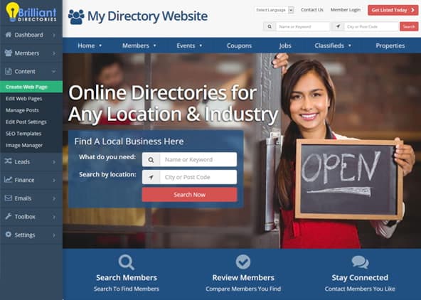
This approach aligns perfectly with platforms like Brilliant Directories, where customization and adaptability are built-in features. Leveraging such platforms can significantly streamline the testing process.
Integrating CTAs with Overall User Experience
A standalone CTA, no matter how well-crafted, can’t do the heavy lifting alone. It needs to be part of a larger, cohesive user experience (UX) strategy.
Ensure that your homepage, from the layout to the content, guides the visitor towards the CTA. Every element should build anticipation and lead naturally to the action you want the visitor to take.
Creating a Seamless Journey
Your homepage should narrate a story, with the CTA serving as the climax. This narrative approach ensures a smooth transition from visitor curiosity to member conversion.
With platforms like Brilliant Directories, you have the tools at your disposal to craft such an engaging journey. Their expertise in creating user-friendly, engaging websites has aided thousands in transforming their homepage CTAs into conversion powerhouses.
Final Thoughts: Your Roadmap to CTA Success
In the quest to boost membership sign-ups, a well-strategized homepage CTA is your strongest ally. Remember, it’s a mix of art and science – the art of understanding your audience and the science of positioning, testing, and refining your approach.
Embrace the journey of constant improvement. Keep an eye on emerging trends and be ready to adapt. With tools like Brilliant Directories, you’re not just setting up a CTA; you’re crafting an experience that resonates with your audience and drives results.
Ready to transform your homepage into a membership magnet? Explore Brilliant Directories and its myriad features with a free 7-day trial. Discover how the right tools and strategies can elevate your website and skyrocket your sign-ups. The journey to doubling, or even tripling your membership numbers, begins here. Your audience is waiting. Are you ready to captivate them?


