A well-designed Contact Us page boosts engagement by using clean layouts, strategic colors, and simple forms that include key fields like name and inquiry type. Using color theory, blue for trust, green for balance, enhances user experience. Tips for managing responses include automated replies and prioritizing urgent inquiries, making it easier to build strong connections.
The contact page is where genuine connection begins on a website. Today, this simple page plays a huge role in bridging the gap between visitors and brands. Not only is it a space to gather questions, feedback, and inquiries, but it also shapes visitors’ impressions of accessibility and responsiveness. Creating a great contact page goes beyond functionality; it’s about design, ease of use, and clarity in gathering the right information. By focusing on color theory, strategic layout, and practical contact forms, we can transform the contact page into a welcoming space that visitors genuinely enjoy using.
To help you create an unforgettable contact page, we’ll break down unique layout ideas, explore color choices that evoke emotions, discuss what makes a form inviting to fill out, and share tips on managing incoming messages. Let’s get started.
1. What Layouts Work Best for a Contact Us Page?
Getting creative with layout is a fantastic way to make your contact page memorable. Here are some ideas to consider:
- Simple and Clean: A minimalist design focuses on the essentials, avoiding visual clutter. This layout typically includes a form front and center, with contact details like phone number, address, and social links below.
- Interactive Map Feature: For businesses with a physical location, adding an interactive map can be incredibly useful. It gives users a quick reference, adds a personal touch, and shows you’re open for in-person visits.
- FAQ + Contact Form Combo: Including a FAQ section above the form answers common questions upfront, reducing the number of repetitive inquiries. Visitors get quick answers and still have the option to reach out for specific questions.
Choosing the right layout depends on your brand and audience. A clean, minimalist design works best for professionalism, while a layout with an FAQ and map adds extra functionality.
Why is Color Theory Important on Contact Pages?
Color choices affect the mood and behavior of your visitors. Here’s a quick overview of what colors can achieve on a contact page:
- Blue: Blue conveys trust, calmness, and stability, making it a go-to for businesses looking to make visitors feel secure. A soft blue background with white or gray text works wonders for readability and reassurance.
- Green: Green is linked to balance and harmony, which is perfect for brands emphasizing eco-friendliness or wellness. Lighter greens can feel welcoming, while deeper greens suggest experience and reliability.
- Red or Orange: These colors grab attention and create a sense of urgency, which can be helpful for contact forms emphasizing quick responses or sales inquiries. Use red sparingly, as it can sometimes evoke stress.
Matching colors with your brand personality helps reinforce the user experience. But it’s crucial not to overwhelm—balance is key, especially when designing a page meant to feel inviting and open.
2. What Information Should You Collect on a Contact Form?
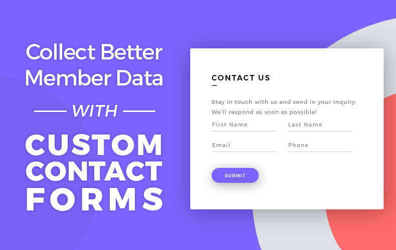
A good contact form doesn’t overcomplicate things. Keep it short and relevant to avoid overwhelming visitors. Here’s what to include:
- Name and Contact Info: Start with basic fields for the user’s name and preferred contact (email or phone). These should always be required, but only ask for a phone number if absolutely necessary.
- Message or Inquiry Type: Add a dropdown menu to help categorize inquiries, like “Support,” “Feedback,” or “Business Inquiry.” It gives users clarity on what to expect and directs queries to the right department.
- Optional Fields: Sometimes, adding a box for “Preferred Response Time” or “Specific Requests” can enhance the user experience. For example, a field for “Preferred Contact Method” can personalize interactions.
Simplicity makes filling out the form easier and reduces abandonment rates. Each field should serve a purpose, ensuring that visitors don’t feel they’re being asked for unnecessary details.
How Can You Make the Form Easy to Use?
Streamlining the form goes a long way in creating a good experience. Here’s how:
- Clear Labels and Descriptions: Each field should have a clear label and, if necessary, a short description to clarify what’s needed. For instance, if asking for a phone number, note whether it’s for follow-up calls or text messages.
- Auto-Fill Enabled: Enable auto-fill to save users time, especially for common fields like name and email.
- Minimal Required Fields: While gathering data is useful, requiring too many fields can turn users away. Only make essentials mandatory.
By keeping the form short and straightforward, you’re encouraging visitors to submit without frustration, which increases engagement and customer satisfaction.
3. Why Responding Quickly Matters
Once you start receiving contact form submissions, responding in a timely and thoughtful way is crucial. Here’s why it’s so important and some ways to stay on top of messages:
- Builds Trust: A prompt reply shows visitors you’re attentive and care about their inquiries. Delays, on the other hand, might leave users feeling ignored.
- Encourages Repeat Engagement: If visitors know they’ll get a quick response, they’re more likely to reach out again, strengthening their relationship with your brand.
- Boosts Brand Image: Responsiveness can set you apart in a competitive space. Providing quick, accurate answers makes your brand memorable.
How Can You Effectively Manage Responses?
Here are some tips for managing your messages efficiently:
- Use an Automated Response: Automated replies can acknowledge receipt of the message and provide an expected response time. This reassures visitors you’ve received their inquiry and will get back to them soon.
- Prioritize by Category: If you’ve added an “Inquiry Type” dropdown, this can help you categorize and prioritize responses. Addressing urgent inquiries first keeps communication organized.
- Set a Daily Review Time: Checking contact form submissions at the same time daily helps you stay consistent with responses and reduces the chance of overlooking messages.
Creating a responsive process makes a big difference in visitor satisfaction and enhances your contact page’s purpose of facilitating real connections.
What Challenges Can You Face with a Contact Page and How Can You Overcome Them?
While the contact page can be highly effective, a few common challenges can arise. Let’s take a look at what these might be and how you can address them:
- High Message Volume: If you’re getting overwhelmed with messages, consider adding a FAQ section to handle common questions upfront. It will reduce the number of redundant inquiries and streamline your workload.
- Spam Submissions: Unfortunately, spam can be an issue. Add a reCAPTCHA or basic verification method to filter out bots and maintain a clean inbox.
- Negative Feedback: Handling criticism can be tough, but replying professionally and acknowledging feedback can turn complaints into positive experiences. Thank users for their feedback, and assure them that their input is valuable.
These challenges can be managed with a few practical steps, making the contact page a truly effective tool.
Turn Your Contact Page into a Powerful Tool for Engagement
Creating a user-friendly, well-designed contact page is an investment in building meaningful connections with your visitors. From design and color to form functionality and timely responses, each aspect plays a part in forming a positive impression of your brand. By paying attention to details and focusing on usability, your contact page becomes a welcoming gateway for communication.
- Explore simple, functional layouts and incorporate elements like maps and FAQs.
- Use color theory to evoke emotions that align with your brand personality.
- Create a form that’s clear, short, and easy to fill out with essential information.
- Stay on top of responses to keep visitors engaged and satisfied.
Let’s elevate your contact page into a tool that does more than collect messages; let’s make it a genuine part of your brand’s story. Give our 7-Day Free Trial a try today and experience the difference in creating a vibrant, engaging contact page!


![[EASY] Spruce Up Your Membership Homepage with These Design Tips [EASY] Spruce Up Your Membership Homepage with These Design Tips](https://www.brilliantdirectories.com/wp-content/uploads/2020/07/essential-website-homepage-elements-800x450.jpg)


